Alright, let’s talk about mobile-friendliness.
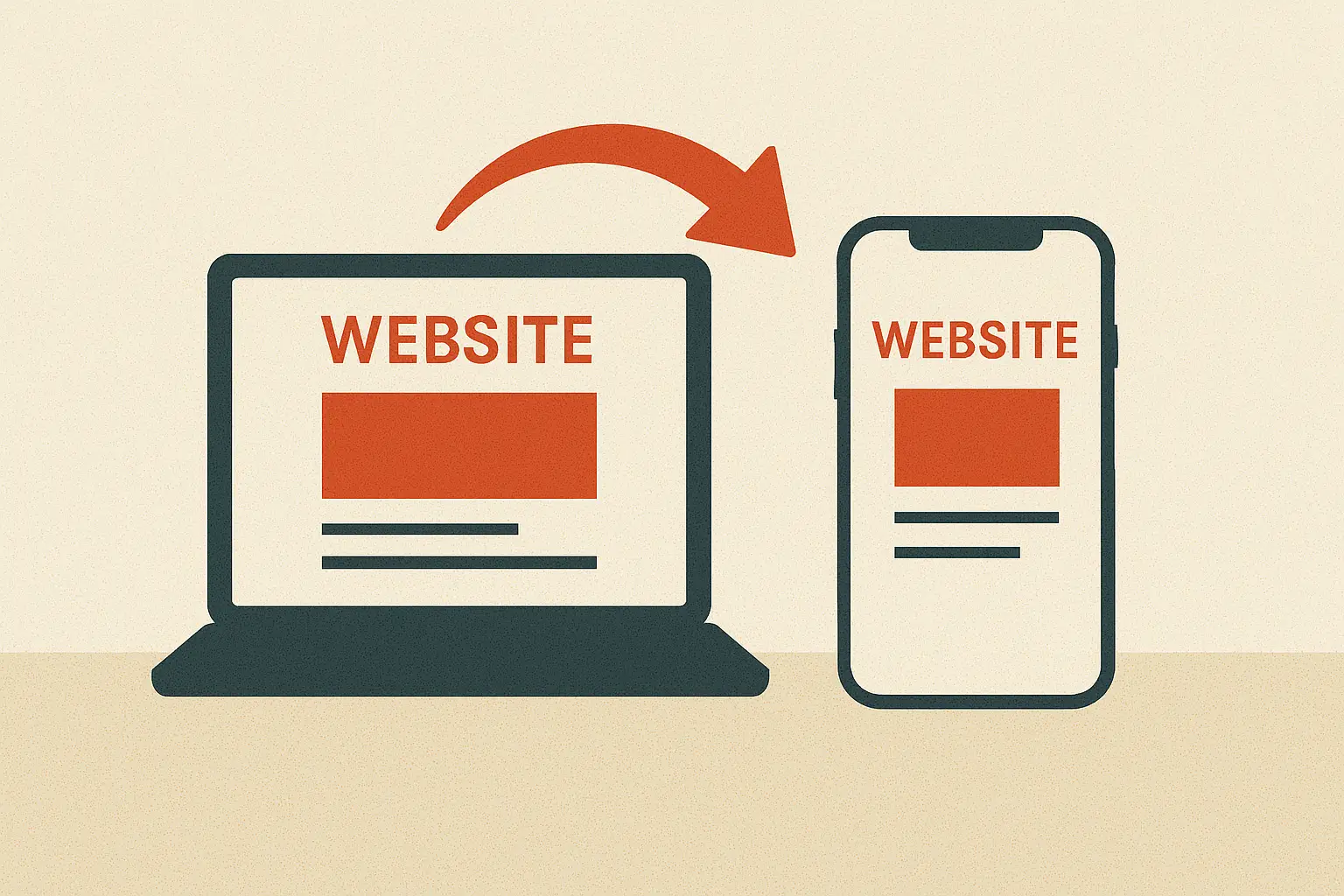
Look, if your website isn’t working perfectly on a smartphone in 2025, you’re not just losing traffic—you’re basically telling Google to ignore you. We’re well past the point where a mobile-friendly site was a nice-to-have. It’s now the price of entry.
Think of it like this: most of the people who find you on Google are going to be on a phone. If they click your link and see a tiny, unreadable mess they have to pinch and zoom to see, they’re gone. They’ll hit the back button and go straight to your competitor. That’s a terrible user experience, and Google sees that. When Google sees that, it drops your rankings faster than a lead balloon.
Here’s the deal: Google uses the mobile version of your site for indexing and ranking. They call it mobile-first indexing. It’s not a joke. It’s the law of the digital land.
So, how do you fix it? This isn’t just a technical task; it’s a user experience challenge. Here’s a detailed, step-by-step guide to making your site a mobile powerhouse.
Step 1: The Diagnostic (Get a Clear Picture)
Before you do anything, you have to know what’s broken. Don’t guess. Use these free tools to get a clear, data-driven report card.
- Google’s Mobile-Friendly Test: This is your starting point. Just type in your URL, and Google will tell you if your site is considered mobile-friendly. It’s a simple pass or fail, but it’s the first step to seeing if you have major issues.
- Google’s PageSpeed Insights: This goes deeper. Check your site’s mobile score. Pay close attention to the “Core Web Vitals” section—specifically “Largest Contentful Paint,” “First Input Delay,” and “Cumulative Layout Shift.” These metrics measure how fast your page loads, how quickly it becomes interactive, and how much content shifts around on the screen. A good score here is crucial.
Step 2: The Foundation (Get a Responsive Design)
If you’re still on a separate mobile site, you’re fighting a losing battle. The industry standard—and the best practice—is a responsive design.
- What is Responsive Design? It means your website’s layout automatically adjusts to fit the screen size of the device it’s being viewed on. The same code and content work on a 27-inch monitor and a 5-inch smartphone screen.
- Why It’s So Important: It’s easier to manage (you only have one site to update), it provides a consistent user experience, and Google loves it. If your current site isn’t responsive, it’s time for a redesign. This isn’t just about looks; it’s a fundamental fix for long-term growth.
Step 3: Optimize for Speed (The Mobile Killer)
Slow sites are a death sentence on mobile. People are impatient. They’re on the go. Every second counts. Here’s how to speed things up:
- Compress Your Images: This is the most common reason for a slow site. Use a tool like TinyPNG or a plugin like Smush to compress images before you upload them. You want a high-quality look with a small file size.
- Minify Your Code: Get rid of all the unnecessary spaces, comments, and line breaks in your HTML, CSS, and JavaScript files. It makes the file size smaller and helps the browser load it faster. There are plugins and online tools for this.
- Leverage Browser Caching: Tell your users’ browsers to store a copy of your site’s static resources (like your logo, CSS, and JS files). The next time they visit, the site will load lightning-fast because the browser already has the files.
- Use a Content Delivery Network (CDN): A CDN stores copies of your site’s files on servers all over the world. When a user visits your site, the content is delivered from the server closest to them, dramatically reducing load times.
Step 4: The User Experience Fixes (Focus on Fingers)
This is where you make your site feel good to use. You’re designing for a thumb and a finger, not a mouse.
- Readable Fonts: Make sure your font size is at least 16px. Anything smaller is a pain to read. Use a font style that’s clear and simple.
- Sufficient Touch-Target Spacing: Your buttons and links should be big enough and spaced far enough apart that a user can tap them without accidentally hitting something else. Google recommends at least 48 pixels by 48 pixels.
- Easy Navigation: Ditch the confusing navigation menus. The hamburger menu is a standard for a reason. Make your search bar prominent so users can find what they’re looking for quickly.
- Clear Calls to Action (CTAs): Your CTA buttons should be a color that stands out and the text should be short and to the point. Make them impossible to miss.
- Avoid Annoying Pop-ups: There’s nothing worse than landing on a mobile site and being hit with a full-screen pop-up you can’t close. Use smaller, less intrusive banners or slide-ins that don’t block the content.
Step 5: Test, Test, and Test Again
You’re not done yet. You need to see your site through the eyes of a user.
- Test on Real Devices: Don’t just rely on online simulators. Grab your own phone, your spouse’s tablet, and maybe a friend’s device. Check how your site looks on different screen sizes and operating systems.
- Ask for Feedback: Ask a friend or a family member to try and complete a task on your site (like buying a product or filling out a form). Watch what they do. You’ll be surprised by the issues you find.
This isn’t about being perfect right away. It’s about being better than your competitors. A mobile-friendly site is a powerful tool for winning over users and, in turn, winning with Google. Start with one of these steps and just keep going. Your traffic will thank you for it.