
Latest Articals
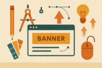
How to Make Website Banners That Convert
When someone lands on your website, you’ve got less than five seconds to make an impression. In that tiny window, your visitors are already deciding: Do I stay or do I leave? And one of the first things they see—the silent salesperson sitting right at the top—is your website banner.
Think of it as your digital billboard. Except instead of sitting on the side of the highway, this one greets every single visitor who walks through your digital front door. And unlike a static roadside sign, your website banner can move, update, and be tracked for performance.
But here’s the catch: most businesses either underutilize banners or overload them with clutter. The result? Visitors ignore them. So today, let’s break down how to use website banners strategically—to capture attention, drive conversions, and actually add money to your bottom line.
What Exactly Is a Website Banner?
At its core, a website banner is a prominent graphic section at the top of your webpage. Sometimes it’s static, sometimes animated, sometimes interactive. But its job is always the same:
- Introduce what your site (or page) is about.
- Highlight an offer, message, or key brand value.
- Guide the visitor toward the next action.
There are different types of website banners:
- Hero Banner (Homepage Banner): The big one on your homepage, usually full-width with a main headline, subtext, and call-to-action button.
- Promotional Banners: Smaller banners that highlight discounts, sales, or seasonal offers.
- Rotating/Carousel Banners: Multiple sliding images or messages that rotate automatically.
- Sticky Top Banners: Thin horizontal bars at the very top, perfect for “Free Shipping” or “Flash Sale” messages.
Done right, your banner sets the tone for the entire site. Done wrong, it’s just wallpaper people scroll past.
Why Website Banners Matter More Than You Think
Let’s be real: people don’t read websites; they scan them. Eye-tracking research has shown that the banner is one of the first focal points users look at when they land on a page. That means it’s valuable real estate.
Here’s what a powerful website banner can do for you:
- Increase conversions by highlighting your main offer.
- Reduce bounce rates by immediately telling visitors why they should stick around.
- Strengthen branding by reinforcing your company’s tone, colors, and identity.
- Guide customer journey by giving clear next steps (Shop Now, Learn More, Sign Up).
A banner isn’t just decoration. It’s strategy.
The Anatomy of a High-Converting Website Banner
So what makes a banner work? Here’s a framework:
- Headline That Pops
This is your hook. Short, bold, and instantly clear. Example: “Drive Home in Your Dream Car Today” for a dealership, or “Upgrade Your Workflow with AI Tools” for SaaS. - Subheadline/Supporting Text
A little extra context. Keep it brief, but show value. - Visuals That Support the Message
High-quality images, clean graphics, or even subtle animations. Avoid stock photos that look staged. - Call-to-Action (CTA)
One button. One clear action. Shop Now. Book a Demo. Get Started. Don’t clutter with multiple choices. - Brand Consistency
Use your brand’s fonts, colors, and voice. The banner should feel like part of the whole experience.
Common Banner Mistakes to Avoid
Most businesses fall into one of these traps:
- Too Much Text: If your banner looks like a blog post, people won’t read it.
- Generic Imagery: Nobody trusts a stock photo of three people shaking hands anymore.
- Weak CTAs: “Click Here” is lazy. Be specific—“Start My Free Trial” is better.
- Overloaded Carousels: Most visitors don’t wait around to see the 4th slide. Pick your best message.
- Not Mobile-Friendly: If your banner text cuts off on mobile, you’re losing conversions.
Website Banners and SEO
Here’s where most people overlook banners: they can help your SEO too.
Search engines crawl banners like any other part of your site. That means if you optimize them, they can contribute to rankings and traffic.
Tips for SEO-rich banners:
- Use alt text for images with your target keywords.
- Keep headlines aligned with your page title and meta description.
- Optimize file sizes—slow-loading banners kill SEO.
- Link CTAs strategically to internal pages you want to rank.
For example, if you’re a car dealership targeting “used Toyota Camry in Chicago”, your homepage banner could read:
“Chicago’s Trusted Toyota Camry Dealership – Drive Yours Home Today.”
That way, you’re hitting both SEO and user intent.
Examples of Effective Website Banners
Let’s paint a picture:
E-commerce Example: A fashion store banner with:
- Big headline: “Summer Sale – Up to 50% Off”
- Bright visuals of new arrivals
- CTA: “Shop the Collection”
Local Business Example: A dentist’s website banner with:
- Headline: “Brighten Your Smile in Just One Visit”
- Friendly image of real patients
- CTA: “Book Your Appointment”
SaaS Example: A project management software banner:
- Headline: “Manage Projects. Save Hours. Grow Faster.”
- Visual of dashboard screenshot
- CTA: “Start Free Trial”
These banners aren’t just pretty—they’re profit drivers.
The Future of Website Banners
Now here’s where it gets exciting. Banners aren’t stuck in the past; they’re evolving.
- Personalized Banners
Imagine a banner that changes depending on who’s visiting. New customers see a “Welcome Discount.” Returning users see “Continue Where You Left Off.” That’s not the future—it’s happening now with AI tools. - Interactive Banners
Instead of static images, imagine interactive product previews right in the banner. Users can swipe through colors, watch a 5-second demo, or answer a quick quiz. - Video Banners
Short, silent loops that tell your story visually. Perfect for lifestyle brands or tech products. - Dynamic Offers
Real-time countdown timers, geo-targeted messages (“Free Delivery in Dallas Today”), or banners that change with inventory.
These innovations don’t just look cool—they keep visitors engaged longer, which boosts both conversions and SEO rankings.
Step-by-Step: How to Create a Winning Website Banner
Here’s a simple roadmap:
- Define the Goal – Is it to get signups, promote a sale, or tell your brand story?
- Craft the Copy – Write a headline that’s benefit-driven and clear.
- Choose the Visuals – Real images, brand colors, clean layouts.
- Design for Mobile First – Over half your traffic is on mobile.
- Add a Clear CTA – Make it visible, clickable, and action-oriented.
- Test Variations – A/B test headlines, images, and CTAs.
- Measure Results – Track clicks, conversions, and bounce rates.
Final Thoughts
Website banners are not just decoration—they’re one of the most powerful tools in your digital toolbox. They can welcome visitors, build trust, highlight offers, and push conversions forward.
If you treat your banner like prime real estate instead of wasted space, it can become the difference between someone bouncing and someone buying.
The bottom line: a great website banner doesn’t just look good—it works hard.
So the next time you redesign your homepage or launch a campaign, ask yourself: What’s my banner saying right now? And more importantly, is it helping my business grow?
Ready to Build Banners That Convert?
At Clay Media, we design banners and websites that don’t just look great—they’re built to convert visitors into customers.
👉 Let’s turn your banner into your best-performing salesperson. Contact us today to get started.
Recent Blogs
Ongoing Website Maintenance Agency for Service Businesses — Why It Matters
Running a service-based business online requires constant reliability. Therefore, your website must stay secure, fast, and fully functional. As a …
Business Website Update and Backup Services — Why They’re Essential in 2025
Business Website Update and Backup Services — Why They’re Essential in 2025 Running a business online isn’t just about having …
Website SEO | Seed Maintenance Services
Why SEO is Crucial for Seed Services Search Engine Optimization (SEO) is the foundation of online visibility. For seed maintenance …