Established in 2010
Orange County, CA

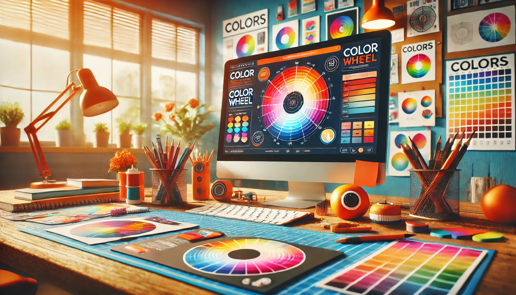
In this day and age, it’s not uncommon to visit dozens of websites on a daily basis. Each of these websites might have the World Wide Web in common, but that’s often as far as the similarities go. With so many great web designs in Orange County and beyond, one of the biggest factors is the appearance – and a good aesthetic can all but guarantee a returning visitor. But what makes a good aesthetic? Well this might come as a surprise, but the groundwork of a website’s appearance actually comes from its color scheme.
Colors play a huge role within the environment, with different hues creating different atmospheres. Many web developers just pick a few colors that seem to match, and then patch together a website. But this isn’t always the best option – especially if you’re trying to create a particular feeling or atmosphere for your website. Here’s a look at what a few of the most popular colors represent and how they can help your site.
Next to white, light blue is the most popular color online. It’s fresh, pleasant and easy on the eyes, and when paired with colors like ivory, peach and white; the feeling of calmness and trust is instant.
Deep red shades trigger an internal instinct amongst viewers – that of the sight of blood. It’s a tricky color to implement properly, especially as most people don’t like the sight of blood, but if done properly it can create an atmosphere that revolves around intrigue and curiosity. Combine deep red with a soft pink or purple for an intriguing design, or brown/ black for a more mysterious aesthetic.
Nothing quite says ‘get up and go’ like lime green. Just the sight of this hue is enough to trigger endorphins, and that’s why it’s ideal for use as a ‘buy’ button, or ‘learn more’. It captivates attention and goes well with several shades – most effective of which are black, grey and white.
Yellow is a tricky shade to master, mostly due to the fact that too subtle a hue can create the feeling of rot and decay. That’s why it’s best to consider yellow a complimentary shade to another color scheme. Green or white for example can often benefit from yellow. Even banner bars can look good with a nice bright, solid yellow tone too. Avoid using it for text though – as it’s so bright it’s even harder to read than white text can be if placed incorrectly.
Not many people know this, but black and white aren’t actually colors – they are shades. As a result, they can complement most colors when used individually or together. There’s nothing to say that you couldn’t include a few tones of grey either, especially if you’re going for a classier feel to your website.
For tips like this and much more, check out our Orange County Web Design services at www.theclaymedia.com

Hey there, fellow WordPress user! Let’s talk about something crucial that often gets overlooked—updating your WordPress site. You might be …

Improving conversion rates on your business website is crucial for maximizing the return on your digital marketing efforts. A high …